Google retired its standalone Mobile-Friendly Test, so now you need a handful of tools instead of a simple pass-or-fail check. Your new process should look at real mobile rendering, viewport quirks, tap targets, layout overflow, crawlability, page speed, and whether your page actually answers what searchers want.
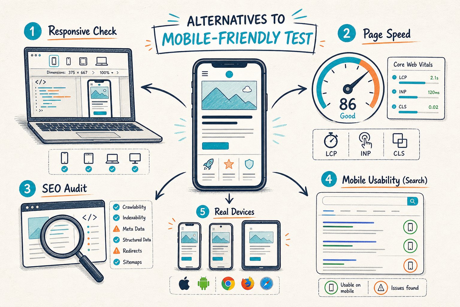
The best Google Mobile-Friendly Test alternatives let you validate changes on staging or behind login walls, compare your page to a top competitor, and track search results after you go live. Passing a mobile layout is just the first step. You’ll also want a speedy, indexable page that gives mobile visitors exactly what they came for.
1) Google Search Console
Best use: Set your search baseline before changing a live URL.
Fire up Google Search Console to zero in on your page, target queries, clicks, impressions, CTR, and average position. This helps you figure out if your issue is visibility, click appeal, or what happens after someone lands.
If your page gets a ton of impressions but a sad CTR, your title or snippet might need work. If it’s buried in the rankings, you could have a bigger relevance or technical mess on your hands.
Check URL Inspection for Google’s indexed version, canonical choice, crawl status, and last crawl date. Then peek at Core Web Vitals and Page Experience trends for the whole property.
Limitation: You can’t test staging URLs or see instant results after a change. Plus, you need enough traffic before any of the data means much.
Start and finish every mobile audit here. It’s your reality check.
2) Check Page SEO
Best use: Audit the rendered page, even if it’s hidden behind a login or on staging.
Check Page SEO runs in Chrome while you’re looking at the exact URL. You can dig into headings, content, entities, links, images, canonical tags, robots directives, schema, and indexability signals, all without sending your URL off to the cloud.
For mobile, check if your DOM has the right H1, solid H2s, readable body text, clear calls to action, and good internal links. You can even size up a ranking competitor and see your Search Console data side-by-side with the audit.
The tool’s score is just a way to prioritize, not a secret Google ranking factor. Always double-check important stuff in the rendered page and in Search Console before you hit deploy.
You can download the Check Page SEO Chrome extension for free. If you want reports, competitor comparisons, or AI-ready prompts, there are premium actions too.
3) Google Lighthouse
Best use: Run a repeatable lab audit while debugging a specific template or URL.
Open Chrome DevTools, pick Lighthouse, select Mobile, and run checks for Performance, Accessibility, Best Practices, and SEO. Lighthouse is your friend when you need to spot render-blocking scripts, giant images, layout shifts, heavy JavaScript, or missing mobile basics.
Run at least three tests and use the middle score. Your local computer, Chrome extensions, network, or cache can make scores bounce around.
Limitation: Lighthouse fakes a mobile environment. It won’t catch real-user field data or what happens on an actual phone, and it can’t tell you if your content really answers the searcher’s question.
Use it during builds, before and after code tweaks.
4) Google PageSpeed Insights
Best use: Compare lab diagnostics with real-user Chrome data.
Google PageSpeed Insights blends Lighthouse lab tests with Chrome UX Report field data, if your URL gets enough traffic. Zero in on mobile Largest Contentful Paint, Interaction to Next Paint, and Cumulative Layout Shift. Then, track down the culprit: is it a lazy image, a slow script, a rogue CSS file, or a wobbly layout?
Field data tells you if real people are struggling. Lab data is better for hunting down the actual technical issue.
Limitation: A low performance score doesn’t always explain a ranking drop. You still need to check indexability, intent, and how you stack up against competitors.
Use it after you spot a mobile speed problem, and again after your fix has had time to collect fresh field data.
5) Chrome DevTools Device Mode
Best use: Catch visual disasters before they go live.
Device Mode lets you play with breakpoints, responsive CSS, horizontal scrolling, sticky bits, modals, viewport settings, and touch layouts. Try widths like 320px, 375px, and 414px, then drag the viewport to see where things fall apart.
Manually check for:
- Text that needs zooming
- Buttons or links crammed together
- Tables or images causing sideways scroll
- Cookie banners blocking the good stuff
- Popups covering your H1 or main call to action
- Hidden content that never shows up after JavaScript loads
Limitation: Device Mode is an emulator, not a real phone. It can miss browser quirks, touch oddities, and hardware headaches.
Use it before launch, especially after any CSS, navigation, consent banner, or template changes.
6) WebPageTest
Best use: Diagnose the loading sequence on a specific mobile connection.
WebPageTest gives you a super-detailed waterfall, filmstrip, request breakdown, and a visual loading timeline. It’s a lifesaver when your Largest Contentful Paint shows up late, a consent tool drags its feet, or third-party scripts hog the early load.
Use the filmstrip for the big question: can your visitor see the main content fast, before ads, banners, chat widgets, or popups take over?
Limitation: It can feel pretty technical, and fancy features may cost extra. It’s not a full SEO or indexability check.
Break it out when Lighthouse spots a speed issue and your devs need a clear trail to the problem child.
7) BrowserStack
Best use: Validate your page on real mobile devices and browsers.
BrowserStack is your go-to when a page looks fine in Chrome DevTools but bombs on a real iPhone, Android, Safari, Samsung Internet, or an old browser. Test menus, forms, checkouts, expandable stuff, chat tools, sticky headers, and tap targets.
For money pages, run through a short test path. Load the page on mobile data, scroll to the main content, hit the call to action, and try the key form. You’ll often spot UX headaches that tools just can’t catch.
Limitation: It’s a paid platform after the free trial. It won’t replace crawling, indexability, or Search Console checks.
Use it before you ship changes to revenue pages, lead gen forms, ecommerce templates, and local landing pages.
8) Screaming Frog SEO Spider
Best use: Find mobile SEO issues across a bunch of URLs.
Screaming Frog SEO Spider shines when one broken mobile template could mess up hundreds or thousands of pages. Crawl with a Googlebot smartphone user agent and check status codes, canonicals, meta robots, titles, headings, image data, internal links, JavaScript rendering, and duplicate content.
You can compare crawl data before and after a major release. That way, you’ll catch accidental noindex tags, new redirect chains, missing H1s, or lost internal links before they tank your site.
Limitation: Authenticated and staging crawls take a little setup. Reviewing rendered pages is more work than just opening the URL in your browser.
Use it when your page-level checks point to a template-wide problem.
9) Google Rich Results Test
Best use: Validate structured data on a live or staged URL.
Google Rich Results Test is for when your mobile page relies on eligible schema, such as Product, Review, Recipe, FAQ, Event, or Local Business markup. Check the rendered result, detected item types, warnings, errors, and whether Google can see the content it needs.
Schema won’t fix bad mobile usability, but it can help you show up with richer search features if your page ticks the right boxes.
Limitation: Valid markup isn’t a guarantee you’ll win a rich result. It doesn’t check speed, content depth, mobile layout, or intent.
Use it after changing templates, schema plugins, product feeds, review widgets, or business details.
10) DebugBear
Best use: Monitor mobile performance regressions after deployment.
DebugBear is your watchdog for scheduled Lighthouse monitoring, performance budgets, trend reports, and alerts if things go south. Track metrics like Largest Contentful Paint, Cumulative Layout Shift, total page weight, JavaScript execution, and third-party impact over time.
This is clutch when a page looks great at launch but gets slower after a tag manager update, new ad script, image swap, or CMS tweak.
Limitation: DebugBear spots regressions, but you’ll still need DevTools, WebPageTest, and your devs to find the real cause. Paid monitoring might be overkill for tiny sites with rare audits.
Use it for high-traffic templates and URLs where mobile performance matters for your bottom line.
A Page-Level Mobile Audit Workflow
Set A Query And Search Console Baseline
Pick one URL and one main query group. In Search Console, jot down clicks, impressions, CTR, average position, and the date range you’ll use for before-and-after comparison.
Split branded and non-branded queries if you can. Make sure your URL ranks for the query you want, not just random side queries with different intent.
Inspect The Rendered Mobile Page And Indexability
Open the page in Chrome, flip on Device Mode, and check: is the viewport working, is the H1 visible, is the body text readable, are calls to action tappable, and is the main content clear of overlays?
Then check status code, canonical, meta robots, structured data, internal links, and what’s actually rendered. For logged-in, draft, or staging pages, a browser-based audit can show you what cloud tools can’t reach.
Compare A Relevant Ranking Competitor
Pick a competitor ranking for the same query and intent. Don’t just grab the biggest domain.
Compare page type, headings, content depth, entities, media, trust signals, internal links, and mobile layout. Don’t copy their word count or keyword stuffing. Look for the missing answer, proof, product detail, or decision aid that makes their page more useful.
Deploy, Annotate, And Measure Equivalent Periods
Write a clear hypothesis before you launch changes. For example: “Making the mobile product table easier to use and cutting script delays will boost engagement and organic clicks for commercial queries.”
Mark the deployment date. Compare matching periods before and after, using the same days of the week. High-traffic pages might show results in a few weeks. For low-traffic ones, you’ll need more patience.
How To Prioritize Mobile SEO Fixes
Likely Search And User Impact
Fix stuff that blocks visitors from seeing the main answer, product details, navigation, forms, or checkout path. Hidden H1s, blocked content, busted menus, accidental noindex tags, or wild layout shifts deserve top priority over minor audit nags.
Use impressions and clicks to guess the page’s opportunity. Then, check conversion value, not just rankings.
Implementation Risk And Rollback Options
Start with fixes that are low-risk and easy to undo, especially if you’re not 100 percent sure. Tweaking an image size or CSS breakpoint is a lot safer than overhauling URL structure, canonicals, rendering logic, or JavaScript frameworks.
Document the original state. Keep screenshots, audit exports, and a rollback plan before you mess with big, high-traffic templates.
Testability On The Exact URL
Prioritize changes you can test directly on the affected URL before going live. Validate staging pages in Chrome, check the rendered HTML, use Device Mode, and test on real devices if the user journey is critical.
A fix you can’t actually test is tough to defend, and even tougher to measure.
Core Web Vitals, Crawlability, And Intent Satisfaction
Think of these as a connected trio. If Google can’t crawl your content, it doesn’t matter how fast your site is.
On the flip side, even if your site is perfectly crawlable, it’s not much use if mobile visitors can’t find what they’re after. It’s like having a shiny store with the doors locked.
Here’s how I’d tackle things, in order of what matters most:
- First, check indexability, status codes, canonical rules, and any major rendering failures.
- Next up, deal with mobile layout issues that block content or stop folks from converting.
- Then, fix Core Web Vitals problems that mess with real users’ experience.
- After that, look for missing query coverage, weak headings, thin trust signals, and gaps with your competitors.
- Finally, spruce up your titles and descriptions to boost click-through rates on those high-impression pages.