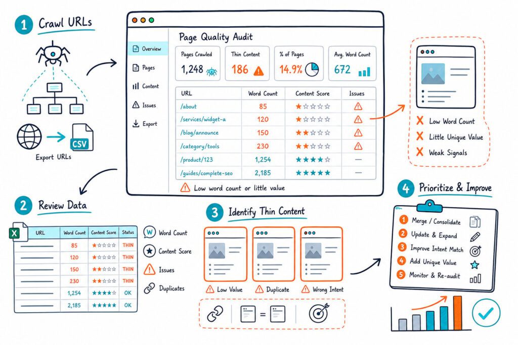
Google retired its Mobile-Friendly Test in December 2023, but you still need to validate mobile pages. With mobile-first indexing, Googlebot primarily evaluates the mobile version of your content, so a desktop page that looks polished can still lose visibility because of mobile rendering, usability, or crawlability issues.
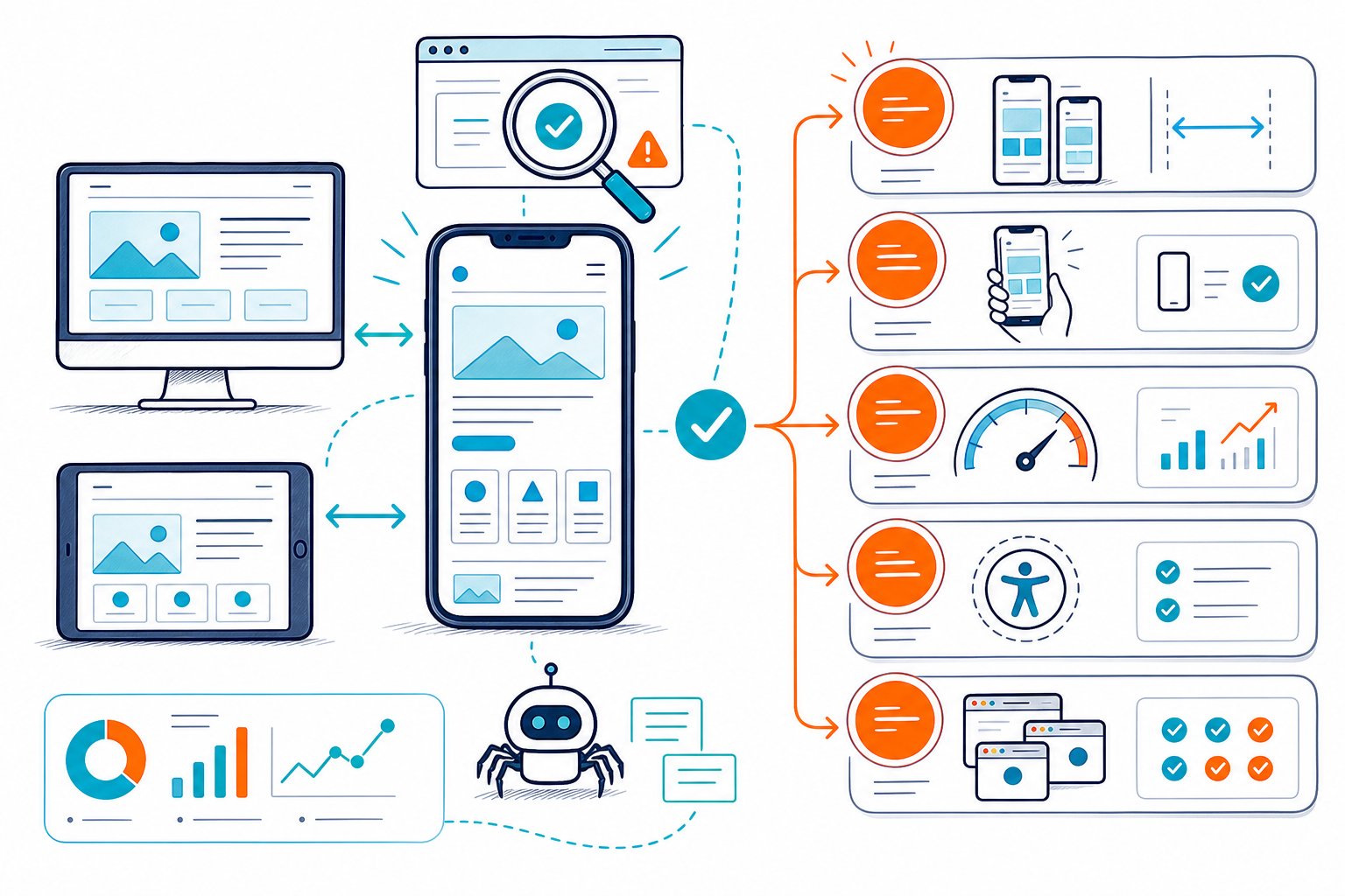
The best Google Mobile-Friendly Test Alternatives for 2026 combine PageSpeed Insights, Chrome DevTools, Search Console, and real-device testing to show how your page performs for users and Googlebot. You need more than the old pass-or-fail result. You need proof that your page renders correctly, stays usable, loads quickly, and exposes the same critical content to crawlers.
What Replaced Google’s Retired Mobile Checker?
Google replaced the standalone checker with a set of diagnostics covering speed, rendering, crawlability, indexing, and search performance. PageSpeed Insights and Lighthouse handle technical testing, while Google Search Console shows whether mobile problems affect your indexed URLs and clicks.
| Check | PageSpeed Insights | Lighthouse / DevTools | Google Search Console | Third-Party Checker |
|---|---|---|---|---|
| Field data | Yes | No | Search performance | Varies |
| Lab diagnostics | Yes | Yes | No | Varies |
| Device emulation | No | Yes | No | Limited |
| Indexing status | No | No | Yes | No |
| Bulk URL checks | No | Possible | Yes | Varies |
Why the Standalone Test and Mobile Usability Report Were Retired
Google retired the Mobile-Friendly Test, its API, and the Mobile Usability report on December 1, 2023. The old test focused on a narrower set of signals, including viewport setup, text size, content width, and tap targets.
Your current workflow needs broader page-experience checks. A page can fit a phone screen and still frustrate visitors with slow interactions, shifting layouts, blocked scripts, or a broken checkout form.
Which Legacy Mobile Checks Still Matter
You should still validate the core checks that made the original mobile-friendly checker useful:
- A viewport meta tag that supports responsive scaling
- Content that fits the visible screen width
- Text that remains readable without pinch zoom
- Tap targets with enough spacing
- Resources that Googlebot can load
- No mobile-only interstitial blocking the main content
These checks affect how people use the page. They also help uncover technical defects that hide important content from mobile-first indexing.
PageSpeed Insights for Field Data and Lab Data
Use Google PageSpeed Insights to review mobile Core Web Vitals and lab diagnostics for a single URL. Field data reflects real Chrome users when enough data exists, while lab data gives you a controlled test for debugging.
Focus on LCP, CLS, and INP. INP is especially useful when menus, filters, search fields, accordions, and forms feel sluggish after a user taps them. Test your important templates separately because a strong homepage score doesn’t prove that category, product, article, or lead-generation pages work well on mobile.
Lighthouse and Chrome DevTools for Diagnostic Testing
Run Lighthouse in Chrome DevTools when you need a detailed technical diagnosis. You can inspect render-blocking files, oversized images, unused JavaScript, accessibility faults, and mobile performance opportunities while working on the page.
Chrome DevTools also lets you throttle CPU and network conditions. Test on a slower mobile connection before release, because a page that feels fine on an office network can reveal script and image problems on a mid-range phone.
Google Search Console for Crawlability, Indexing, and Search Impact
Use Google Search Console to confirm that Google indexed the URL and selected the intended canonical. The URL Inspection tool helps you check crawl status, rendered HTML, indexing decisions, and whether your live page differs from Google’s stored version.
For owned sites, pair technical findings with clicks, impressions, CTR, average position, and ranking queries. If impressions stay high while CTR falls, review the mobile title and snippet. If a high-value page loses impressions after a deployment, inspect indexing and canonical signals before rewriting the content.
When a Third-Party Mobile-Friendly Checker Helps
A third-party mobile-friendly checker helps when you need a quick visual pass or a repeatable audit checklist for many URLs. Use it to spot viewport errors, horizontal overflow, tiny controls, and layout issues before moving into deeper developer testing.
For a broader page review, Check Page SEO audits live metadata, headings, content, links, images, schema, canonicals, robots directives, and indexability from the page open in your browser. You can also use a text-to-HTML ratio SEO diagnostic to identify pages where templates or boilerplate overwhelm the useful mobile content.
How to Audit a Page Across Mobile Devices
A reliable mobile audit combines responsive layout checks, interaction testing, page-speed diagnostics, and crawl verification. Test the page at common phone widths first, then confirm the highest-risk workflows on real devices and compare results after deployment.
Validate Viewport Configuration and Responsive Design
Start with the viewport tag in the page <head>. A common configuration is width=device-width, initial-scale=1, which tells the browser to size the layout to the device viewport.
Then resize the page across narrow and wide mobile widths. Watch for navigation that wraps badly, cards that compress into unreadable columns, images that overflow containers, and components that vanish at breakpoints. Responsive design should preserve access to your primary content and actions at every width.
Find Horizontal Scroll, Content Width, and Blocked Resources
Check for horizontal scrolling on every key template. A single fixed-width table, embedded widget, wide image, or CSS rule can force users to swipe sideways and hide conversion elements.
Inspect blocked resources in DevTools and Search Console. If Googlebot can’t load key CSS or JavaScript files, it may receive a reduced version of your page. Review CSS breakpoints, script-loaded content, cookie tools, and third-party embeds after major releases.
Test Readable Text, Tap Targets, and Forms
Read the page on a phone without zooming. Body copy, labels, disclaimers, pricing details, and error messages should remain clear at a normal viewing distance.
Tap each interactive element near other controls. Small targets create misclicks on filters, product variants, close buttons, and form checkboxes. Test form completion from start to finish, including keyboard behavior, autofill, validation, payment fields, and confirmation screens.
Use a content readability SEO check when mobile pages feel dense. Short paragraphs, useful headings, lists, and clear sentence structure make a narrow screen easier to scan.
Check Intrusive Popups and Interstitials
Open the page in a clean browser session and on a small viewport. Test newsletter overlays, cookie banners, app-install prompts, chat widgets, age gates, and promotional modals.
Make sure visitors can close overlays without hunting for a tiny icon. Your primary content and key conversion action should remain reachable, especially on landing pages from organic search.
Use Device Emulation Before Real-Device Testing
Use Chrome DevTools Device Mode for rapid breakpoint checks and layout debugging. It speeds up testing during development because you can inspect elements, change the viewport width, and reproduce a problem beside the code.
Move to real-device testing for touch behavior, browser UI interference, keyboard overlap, scrolling, fixed elements, and font rendering. Device emulation catches many layout faults, but a real phone reveals the friction users actually feel.
Choose WebPageTest, GTmetrix, BrowserStack, or LambdaTest
Choose the tool based on the problem you need to solve. WebPageTest is useful for filmstrips, waterfalls, and repeat-view performance. GTmetrix works well for quick performance reviews and prioritized technical findings.
BrowserStack and LambdaTest help you test real browser and device combinations. Use them when a page works in Chrome emulation but fails in Safari on iPhone, Samsung Internet, or an older Android browser. Keep a short list of your highest-traffic device and browser combinations from Google Analytics.
Verify Mobile Content, Metadata, Links, and Indexability
Confirm that your mobile page contains the same primary content, structured data, titles, meta descriptions, canonical tags, internal links, and robots directives you expect Googlebot to process. Mobile-only content gaps create indexing and relevance risks.
Check Page SEO lets you inspect these live-page elements while viewing staging pages, CMS drafts, login-protected URLs, or competitor pages. Review competitor meta tags and headings when a competing page has stronger mobile search visibility and you need to find missing sections or weak heading coverage.
Prioritize Fixes and Measure Results After Release
Fix the critical failures first: blocked resources, noindex directives, broken canonicals, missing primary content, unusable forms, and severe horizontal overflow. After that, tackle speed, readability, image weight, and secondary layout issues.
Record the release date, then compare equal time periods in Search Console once Google has recrawled the page. Review impressions, clicks, CTR, and average position by URL and query.
For ongoing audits, Download the Check Page SEO Chrome extension to scan the live mobile page, export findings, and turn issues into developer-ready tasks.