Oversized images waste bytes before your page gets a chance to prove its value. They slow website speed, hurt image performance, and create a rougher user experience, especially for people browsing on mobile connections.
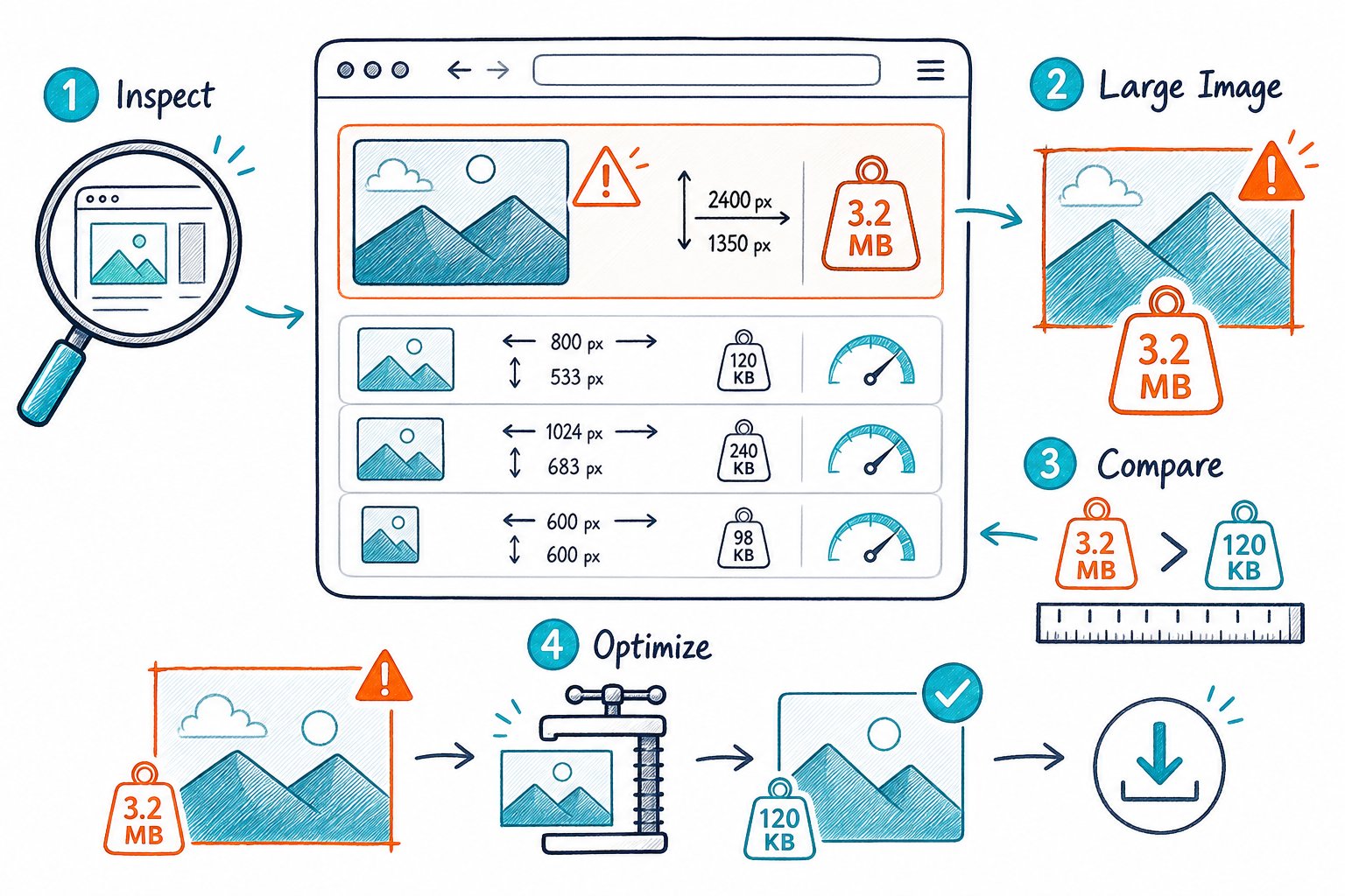
You can find oversized images on a web page by comparing each file’s natural dimensions and transfer size with its displayed dimensions on real devices. Start with the largest visible images, then check that your responsive image setup sends the right file for each viewport.
What Makes an Image Oversized and Why It Matters
An image is oversized when the browser downloads far more pixels or bytes than the displayed space needs. A 3,000-pixel-wide hero image sitting in a 600-pixel content column wastes bandwidth unless high-density screens genuinely need that extra resolution.
That waste shows up in page speed data, visual loading delays, and poor mobile performance. Focus on the rendered page, because CSS, templates, and responsive rules ultimately decide what visitors see.
Natural vs. Displayed Dimensions: What Should You Compare?
Compare the image’s natural dimensions with its displayed dimensions. Natural dimensions are the original file’s pixel dimensions, while displayed dimensions are the CSS pixels the image occupies on the page.
For a 600px-wide image slot, a 1,200px-wide file supports a 2x display density and stays sharp on many high-density screens. A 3,000px-wide JPG, JPEG, WebP, or PNG in that same slot deserves a closer look.
| Check | Example |
|---|---|
| Displayed width | 600px |
| Sensible maximum file width | 1,200px |
| Likely oversized file | 3,000px |
| Priority signal | Large transfer size above the fold |
Don’t forget CSS background images. They often slip past basic image reports because stylesheets load them, even though they can become the biggest visual asset on the page.
How Large Images Affect LCP, Core Web Vitals, and Loading Speed
Large hero images delay the moment your main content becomes visible. When an image is the LCP element, every unnecessary byte competes with HTML, CSS, scripts, fonts, and the rest of the page’s resources.
Core Web Vitals have made this problem harder to ignore than it was in the early days of SEO, when image optimization was often treated as a small compression task. Image size now affects the real loading experience, particularly when mobile visitors are dealing with slower connections.
Set width and height attributes, or reserve space with CSS aspect ratios. That gives the browser a layout box before the image loads and helps reduce layout shift.
Which Images Deserve Attention First?
Start with the images that affect the first screen visitors see:
- Your hero image, product image, or featured image.
- Large background images in banners and page headers.
- Images identified as the LCP element in performance testing.
- Repeated large thumbnails on category, collection, and search pages.
- Below-the-fold images loading before they are needed.
Check Page SEO helps you review live image assets alongside metadata, links, indexability, and other on-page SEO checks. Pair image findings with the page’s search intent before making changes. To be fair, the strongest visual asset often supports conversion as much as SEO.
How to Audit, Prioritize, and Fix Image Waste
A useful image audit finds the files consuming the most bytes, confirms their visible size, and tests the replacement on the live page. Your fixes should protect visual quality, LCP, and layout stability across desktop and mobile viewports.
Use browser checks for important URLs, then crawl at scale to uncover template problems across your website.
Use PageSpeed Insights, Lighthouse, and Chrome DevTools for Page Checks
Run PageSpeed Insights or Lighthouse on a priority web page and review image-related opportunities such as properly size images and efficiently encode images. When the LCP image appears in the report, make it your first performance task.
In Chrome DevTools, inspect an image and compare its rendered size with naturalWidth and naturalHeight. Use the Network panel to sort assets by transferred size, then reload with cache disabled to see what a first-time visitor downloads.
A browser-based audit comes in handy for pages behind a login wall, staging environments, or CMS previews. You can also optimise existing web page content while checking the surrounding headings, copy, and internal links that share the same page budget.
Audit Image Assets Across WordPress, Shopify, and Larger Sites
For WordPress and Shopify, review the original uploads and the generated image variants. A theme may request the full upload even when a thumbnail, product card, or collection grid only needs a smaller version.
For larger sites, crawl representative page types: home pages, blog posts, product pages, category pages, location pages, and campaign landing pages. Screaming Frog can expose image URLs and file sizes across accessible URLs, while privacy-first browser tools let you inspect the rendered page without sending private or staging URLs to a cloud crawler.
Track each issue in a simple list:
- Image URL and page URL
- Natural and displayed dimensions
- File format and transferred size
- Whether the image is above the fold
- Whether it contributes to LCP
- Required replacement size or
srcsetfix - Missing alt text, if applicable
Resize, Encode, and Deliver Images for Each Viewport
Create image variants that match the layout widths your site actually uses. Use srcset and sizes so browsers can choose an appropriate file for the viewport, then test the selected candidate on mobile.
WebP and AVIF reduce file weight for many photographic images. JPG and JPEG remain useful when your publishing workflow needs broad compatibility. PNG works well for images requiring transparency, SVG suits vector logos and icons, and GIF files deserve a review because an animated alternative may be lighter.
Use lazy loading for below-the-fold images. Keep your LCP image eager-loaded, and avoid lazy loading the main hero image because that delays the resource your visitor needs first.
Write alt text based on the image’s purpose in the content. Decorative images can use empty alt attributes, while meaningful product, process, or informational images need concise, descriptive alt text.
Validate the Fix Without Hurting LCP or Layout Stability
Re-test the exact page after deployment in Lighthouse, PageSpeed Insights, and Chrome DevTools. Confirm that the new image looks sharp at common viewport widths, loads before the LCP deadline, and sits inside a stable layout box.
Check the Network panel to make sure the browser selects the expected WebP, AVIF, or responsive image candidate. A correct srcset implementation can still miss the mark if the sizes attribute tells the browser the image slot is wider than it really is.
Review the image report alongside your technical findings before closing the task. Then Download the Check Page SEO Chrome extension to audit live page images, missing alt text, oversized files, and related on-page issues while you view the page.